 In 1996, the Internet Archive began archiving the web for a service called the Wayback Machine. They've now archived 55 billion web pages. That's enough web pages that if you were to print them all out using your roommate's printer while he was at class and tape them end-to-end, you could reach the moon and back 28 trillion times. I decided to peruse the Wayback Machine's earliest archives to see what the internet looked like in 1996, when I was 14 and evidently had much less free time than I do now. Much to my chagrin, few websites from these early years have been successfully archived, and many of the best preserved ones were created by fast food and soft drink corporations because they were some of the earliest adapters of the internet. They viewed the medium as a chance for inexpensive advertising and invested dozens upon dozens of dollars into it. The results are tremendously humiliating. In their defense, the technology was different in 1996. Although Internet Explorer 3.0 could run Java applets and inline media, Netscape Navigator could not, and in any case nobody felt comfortable doing anything more complicated than making a few animated GIFs. Additionally, very few web designers had even the most rudimentary of aesthetic sensibilities, and nearly half of them were clinically retarded. The internet in 1996 looks like it had been created in its entirety by a panel of 13-year-olds with Geocities accounts who had about half an hour to spare each night before bedtime. To prove my case, I took some screenshots after cordially adjusting my monitor resolution to 1024*768. I tried 1996's recommended 800*600, but at that resolution a single word took up my entire field of vision. If you would like to visit these archived websites yourself, please click on the screenshots. In some cases you can then navigate parts of the website exactly as one would have in 1996, but do not do this. There is nothing interesting to find and you would do well to avoid prolonged exposure to this heinous baby of an internet. In fact, I can't in good conscience even recommend you read this article. McDonalds.com
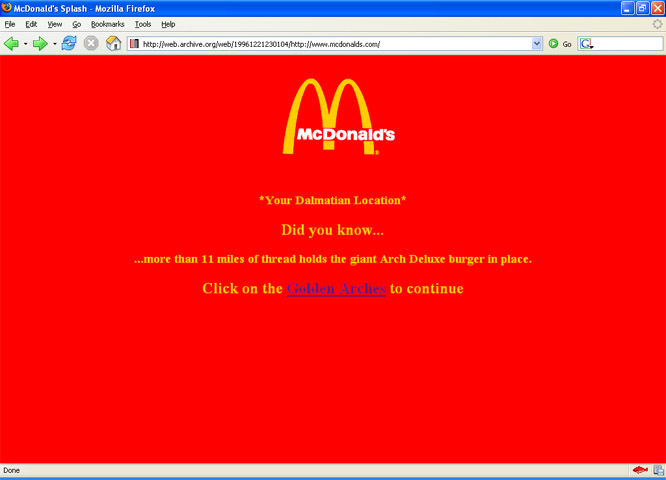
This is the front page of McDonald's, or as the company is more commonly known, "Your Dalmatian Location." There's not much of a point to this page other than to ask one very salient question: Did you know ... more than 11 miles of thread holds the giant Arch Deluxe burger in place. (The web designer was unable to locate the question mark key.) No indication is given as to what a "giant Arch Deluxe burger" is, but it sounds pretty appetizing as long as you pick around all the thread. I am sort of disappointed they didn't reveal exactly how many miles of ground-up Dalmatians were used to make this delicious treat, or ask a question I knew the answer to, such as one about how many inches of pubic hair are used to make a Big Mac sandwich (two inches).
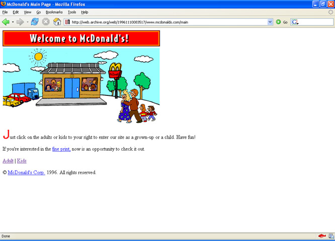
This is page 2 of McDonald's. Here we have the rare opportunity to read McDonald's fine print, but if for some reason that doesn't fascinate you there are a few other options. You may 1) Look at the (extremely shitty) drawing featuring seven retarded children pressing their face up against the window in an apparent attempt to escape McDonald's, or 2) Decide whether you want to "enter the website" as a Grown-up or a Child. You mean to tell me we still haven't actually entered the website? You realize that in 1996 each of these pages would have taken twenty minutes to load? Where is the actual website? Is there an actual website? I clicked on both the Adult and Kids entrances, but they inexplicably led me to the exact same place, which is to another shitty drawing. By this time it was pretty obvious that I was being dicked around. NyTimes.com
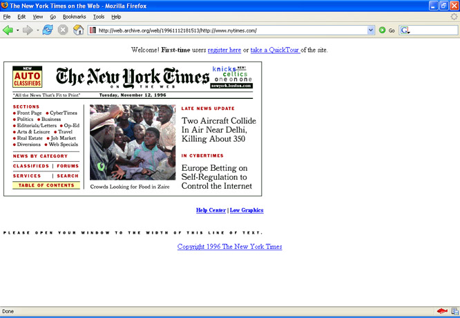
Web design in 1996 is very easy--you just format a page however you want and say, "Please open your window to the width of this line of text." No, don't worry what type of monitor your visitors have. They won't be seeing any awkward white space so long as they manually line up their windows to a specified line of text like the little jackasses they are. If they're so intent on preening around with their own specialty window size they can go make their own goddamned website. Accounting for disparate visitors is far too big a headache when you're working with such complex variables as JPEGs, fonts, and hyperlinks. That's why most websites from this time will also recommend which browser, operating system, and monitor resolution you use. Unless your settings are exactly the same as the web designer's, you might as well go fuck yourself. BestBuy.com
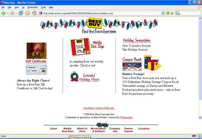
You'll notice a few things about Bestbuy.com. The first thing is that although Best Buy has cornered the market on computers, their website looks like complete ass. The second is that they, too, are obsessed with Dalmatians, going so far as to include an "101 Dalmatians Holiday Savings Coupon Book." Sounds pretty good, but not good enough to reward Best Buy with the annual "Your Dalmatian Location" trophy. The last thing you will notice about this website is that there is a pig on the left who is giving us a gift. When I actually visited the website, he was animated: he pulled out the gift from behind his back and then presented it to me, as if I was supposed to know who the fuck he was and why I had made his gift list. Next time I'm in 1996 remind me to never visit Bestbuy.com. WhiteCastle.com
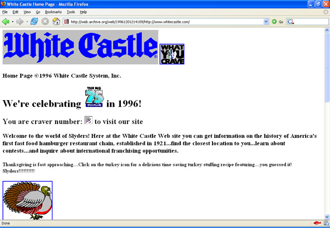
The highlight of this website is their "delicious time saving turkey stuffing recipe featuring....you guessed it! Slyders!!!!!!!" Wow, I didn't guess that at all. What the hell is a Slyder? What I can guess is that if you would ever consider making your Thanksgiving stuffing out of White Castle food, you probably didn't have access to the internet in 1996. In fact, chances are pretty good that you don't have internet access now and that you are in fact a hobo. Pepsi.com
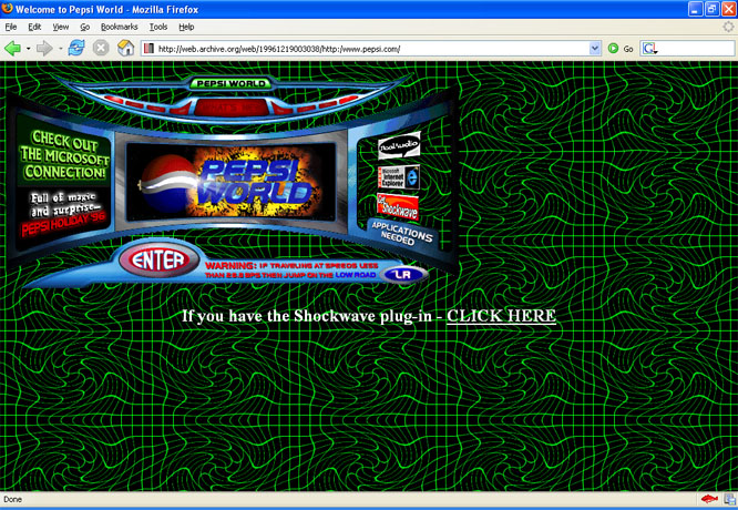
Oh God. Oh dear God in heaven no. Your first instinct will be to repeatedly jab a pinecone in your eyes, but please try to understand Pepsi's mindset. First, they were almost definitely drunk. Secondly, they knew that the internet was in some way related to computers, so the idea was to make their website very evocative of a computer. I'm not convinced they understood what a computer was, but when they closed their eyes and thought about computers, this monstrosity is what popped into their drunken heads. First you have a background which looks like a piece of graph paper after it has been used to smash up a family of frogs. On top of this is a sort of three-dimensional computer terminal, as if the fact that you're using an actual computer to view the website isn't quite "computery" enough. In the center of this is something called "Pepsi World," which has just exploded. All of these elements combine to give me a kind of headache that is very small but will never go away. The only part of this website that I liked is the what's new page. You can tell Pepsi knows what is new just by looking at their cutting-edge "what's new" logo: Clorox.com
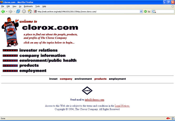
You might be confused why I checked out Clorox.com, since such a website has no reason existing now let alone in 1996. It's because there was a jug of Clorox in the corner of my eye while I was finding websites for this article. But it turns out that Clorox.com is a great website. If you were ever curious as to what the internet would have looked like had it been around in 1953, this is it. You'd have a funny little mascot whose body is whatever cockamamie product you're selling, you'd have a few innocuous links for investors, and then you'd pretty much be done. And that concludes the only review of Clorox's 1996 website that will ever be written in the history of time by any person in the world. CocaCola.com
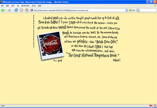
What font is this? Who are we kidding here, Coke? You're not cool, you're a big joke and everybody hates your website. I read the text and was amazed that Coke has the audacity to mock its old 19th-century slogans. The irony here is that "Drink Coca-Cola" is a compelling, understated motto, yet this very website advertisement is an affected, pandering display of inanity. They should really delete the entire thing and just include the sentence "Drink Coca-Cola!" in 12-point font because there is no value to CocaCola.com in 1996 or 2006, and to me their soft drink is the same shit Pepsi sells but in a different can and the only way to drink either is to mix them with rum so that you can forget for a moment that all you're drinking is high-fructose corn syrup and water, and that every can of Coke you purchase merely encourages Coca-Cola's shit-eating advertising agency. Nick.com
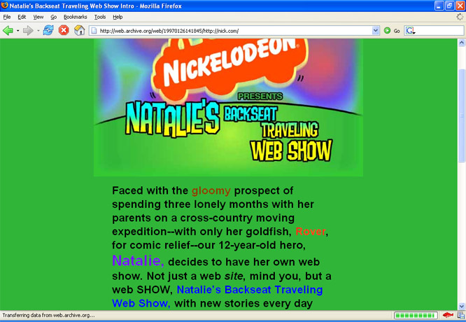
As best as I can gather, the premise for Nickelodeon's website is that Natalie is moving across the country and is feeling mighty gloomy, so she decides to set up the world's first video podcast. Right, Natalie. Just tell me one thing: How in the hell are you going to put on a web show, from the back of a car, in 1997? And why exactly is it going to take three months for your family to move across the country? And isn't it probably true that Natalie was conceived in the same backseat 13 years ago? Where's that show, Nickelodeon? Why won't you talk about that show? Lego.com
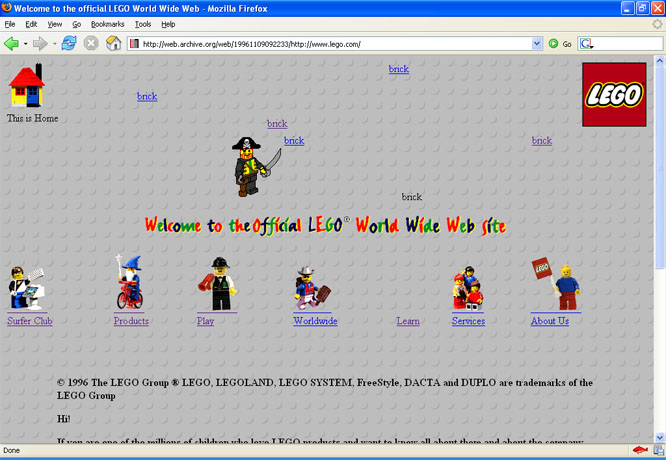
There is very little I can say to rebuke this website. This is the best website I've ever seen. I navigated further into the world of Lego.com '96 and on every single page I was greeted by pirates waving swords, knights riding horses, and overarchingly wizards on bicycles. This page alone has three wizards on bicycles lined up in a very majestic fashion, with an additional bonus wizard on a bicycle in the upper-right corner. In 1996, while most companies were still figuring out how to properly scan their company logo so that it didn't look like a joke, Lego had discovered the key to web design, which is that randomly strewing little Lego men around one's website is hilarious and engaging. If you feel like you need to cleanse your palette after seeing all the other websites featured in this article, please enjoy the following line of Lego men:
From Left to Right: Wizard on Bicycle, Wizard on Bicycle,
Back to eKarjala |